Microsoft has been a dominant force in software solutions across several verticals for decades. But despite the robust nature of its products, they’re not always the best option for a given use case. This is true even for business intelligence (BI) and analytics software.
In our ongoing effort to help businesses choose software vendors based on how well they meet needs rather than sheer brand recognition, we’ve put together a host of articles looking at alternatives to leading solutions.
In this article, we’ll break down some of the most compelling alternatives to Microsoft Power BI.
- Tableau: Best for data visualization
- Domo: Best for large data sets
- Yellowfin: Best for embedded analytics
- Zoho Analytics: Best for non-analysts
- Sisense: Best for end-to-end BI
- Qlik Sense: Best for mobile users
Top 6 Microsoft Power BI Alternatives
Tableau: Best for data visualization
Pros
Cons

Our Rating: 4.3/5
- Leverage Data Without Slowdowns: Tableau supports multiple connection types for a wide variety of data sources. For faster databases, set up direct connection. For slower or more bottlenecked sources, use in-memory data connections to minimize latency.
- Top-Tier Security: Data is more valuable than ever, so it’s a bigger target than ever. Tableau provides a host of permissions and authorization controls, as well as supporting integration with third-party systems like Active Directory.
- First-Class Visualizations: Tableau offers one of the widest and most robust feature sets with regard to visualizing data. Trend lines, predictive analytics, customizable dashboards and reports, and even map support are among its laudable options.
- Improved Data Queries: With the Ask data tool, Tableau enables a measure of Google-level search engine functionality for the data itself. Conduct basic searches and queries with no need for advanced command of SQL or other query languages.
- Mobile Functionality: Sometimes, the data needs to go where you go. That’s why Tableau can be used via mobile devices, enabling your analytics to go anywhere with you.
- Tableau Viewer: $15/user/month, billed annually
- Tableau Explorer: $42/user/month, billed annually
- Tableau Creator: $70/user/month, billed annually
- On-Prem Hosting and Embedded Analytics: Call for Quote
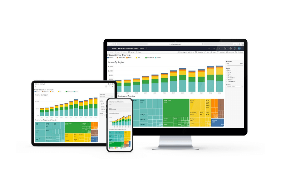
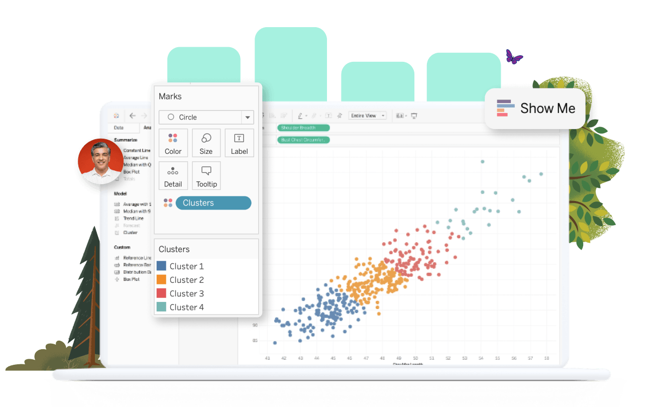
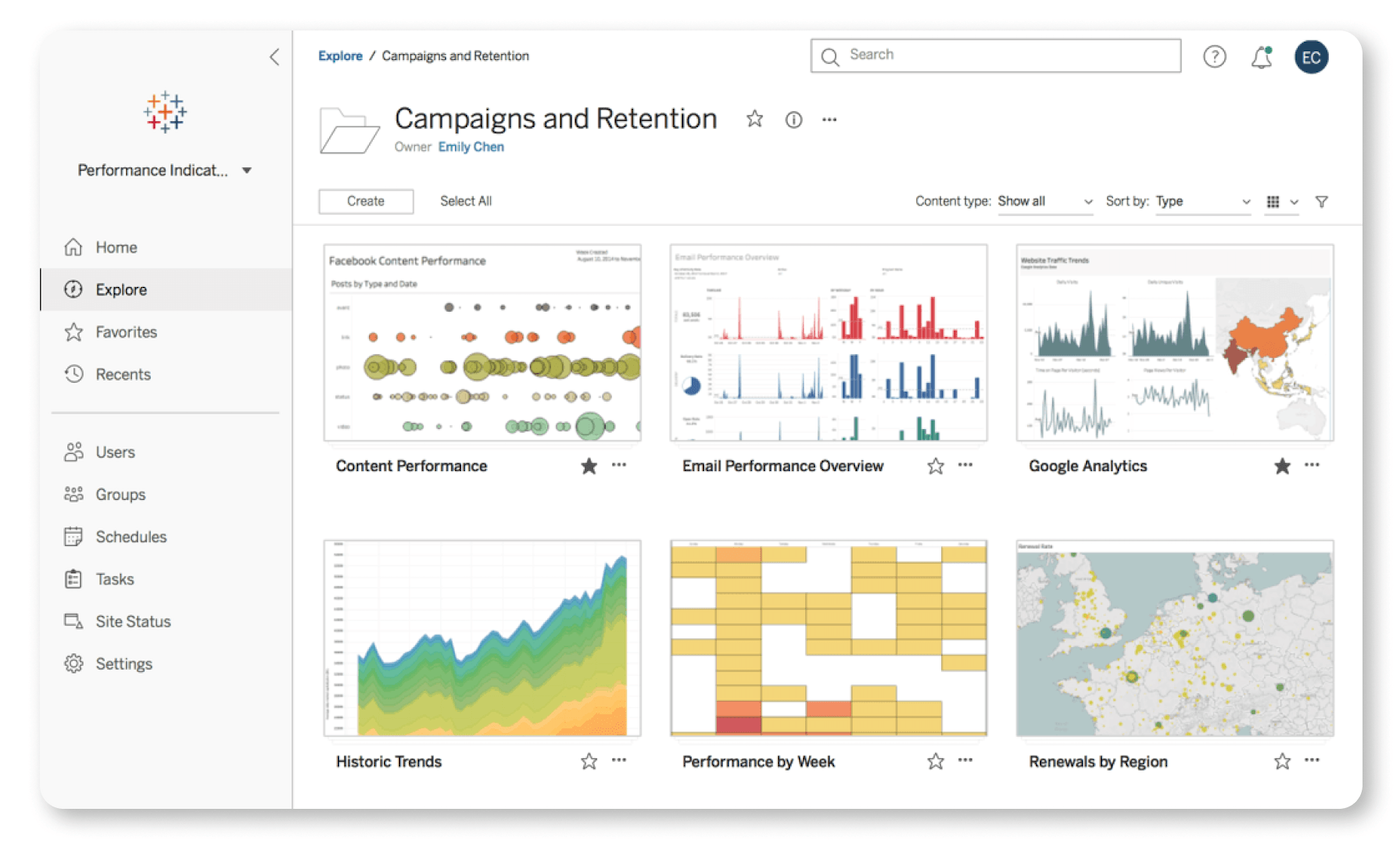
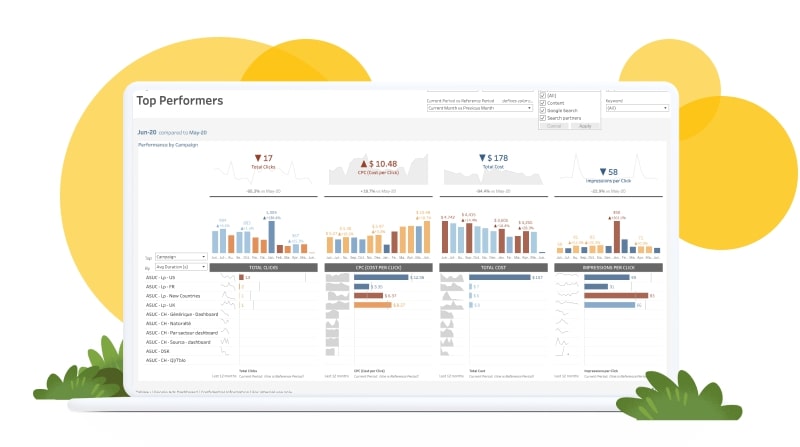
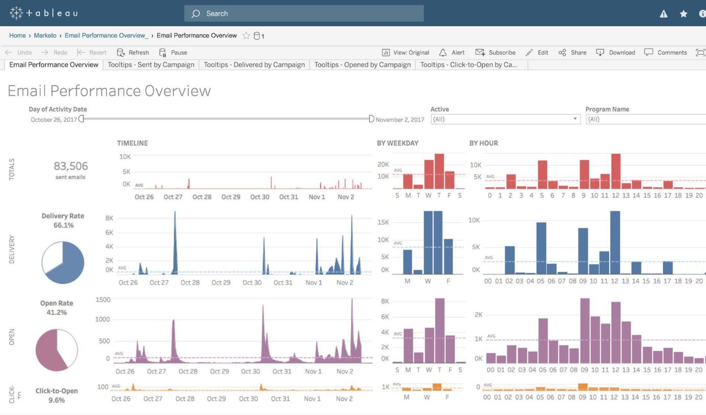
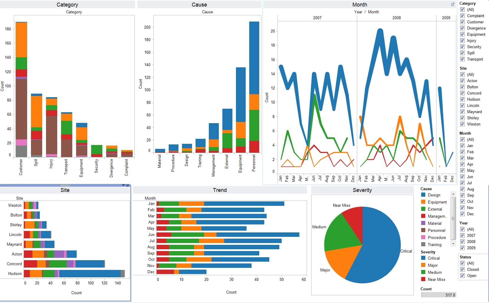
Tableau is the undisputed king of data visualization.
Its expansive market reach and diverse client base, including many recognizable brands, is a testament to its expertise in delivering top-tier analytics solutions. Unlike its competitors, especially Microsoft Power BI, Tableau excels in offering more sophisticated, customizable visualizations, making it the go-to choice for complex data analysis. This distinction is crucial for businesses that require in-depth, adaptable data analysis and visualizations, whereas Microsoft Power BI might be more suitable for those seeking simpler, more integrated solutions with other Microsoft services.
Tableau’s recent updates further solidify its position as a superior option for data visualization. The Embedding Playground, for instance, offers a level of customization and interactivity that is hard to match. The introduction of custom data labels and dynamic axis ranges also speaks to Tableau’s focus on user-centric design, ensuring that data is not only visually appealing but also easily navigable and customizable to suit various business needs.
Regarding product design and user experience, Tableau’s interface, while requiring some initial learning, offers unparalleled customization and control over data visualization. This design philosophy ensures that users can tailor the tool to their specific analytical needs, a feature that sets it apart from Microsoft Power BI, which is known for its user-friendly interface but less customization in data visualization.
While Tableau is a leader in data visualization, it could improve by simplifying its initial setup process and making its pricing more accessible to smaller teams. Enhancing these aspects would make Tableau more competitive against solutions like Microsoft Power BI, which is known for its ease of integration with Microsoft’s ecosystem and user-friendly approach.
Pricing: 4.2/5
General features and interface: 4.3/5
Core features: 5/5
Advanced features: 4.5/5
Integration and compatibility: 4.7/5
UX: 3.3/5
When it comes to market leaders that can go toe-to-toe with Microsoft in the BI space, few would argue that Tableau can be found at the top of the list.
The most recent update, Tableau 2023.3, introduces several notable advancements:
- Embedding Playground: This feature provides an interactive environment for developing custom code in minutes. It allows users to embed interactive visualizations into applications rapidly, enhancing the embedded analytics capabilities of Tableau.
- Custom Data Labels: Improving data discoverability, this feature lets admins define custom labels that creators and explorers can add to data assets. This aids in better discovery and auditing within Tableau.
- Dynamic Axis Ranges: This addition allows more dynamic visualizations by using the value of parameters in the workbook to set axis ranges, offering greater flexibility in data presentation.
Tableau occupies a market position toward the higher end of the enterprise/premium spectrum. With a base cost that’s well beyond most of its competitors and a setup process that requires more extensive data and coding expertise than many of its peers, it’s not for teams looking for the cheapest or most basic solutions.
That said, Tableau can provide a significant boost to teams already equipped to make the most of its analytics and visualization suite. With a little setup and a little training, the tool can cover a broad range of use cases and implementations.
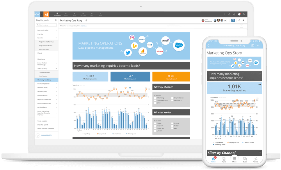
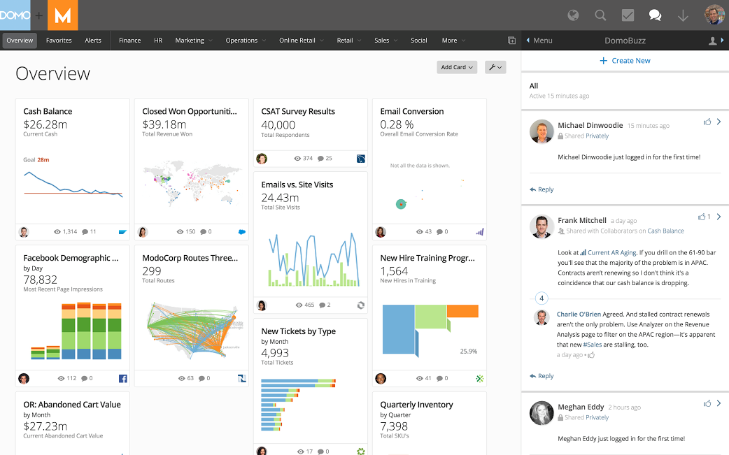
Domo: Best for large data sets
Pros
Cons
Our Rating: 4.2/5
- Data Integration and Ingestion: With over 1,000 pre-built cloud connectors and a powerful system capable of processing massive data sets without issue, Domo is among the best equipped to help brands put their data to work in minimal time.
- Real-Time Analytics: Domo’s platform makes it easy to stay up-to-date and even forecast with confidence. In addition to standard analytics and reporting, the tool enables predictive insights, allowing teams to look to the future and plan accordingly.
- Custom App Creation: With convenient API and SDK tools, Domo can be used to power custom apps and automated workflows, reducing labor requirements and speeding time-to-value.
- Secure Anywhere Operations: Domo empowers teams to work from anywhere, embed their analytics wherever necessary, and maintain permissions and access controls throughout.
- Free trial available
- Call for quote; no listed pricing on website
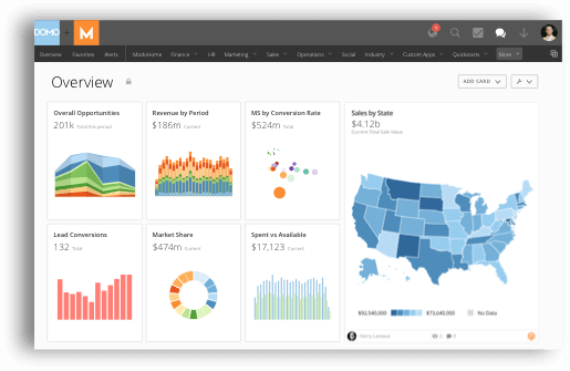
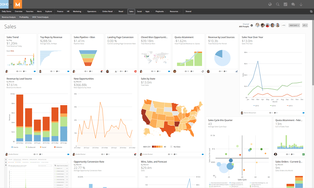
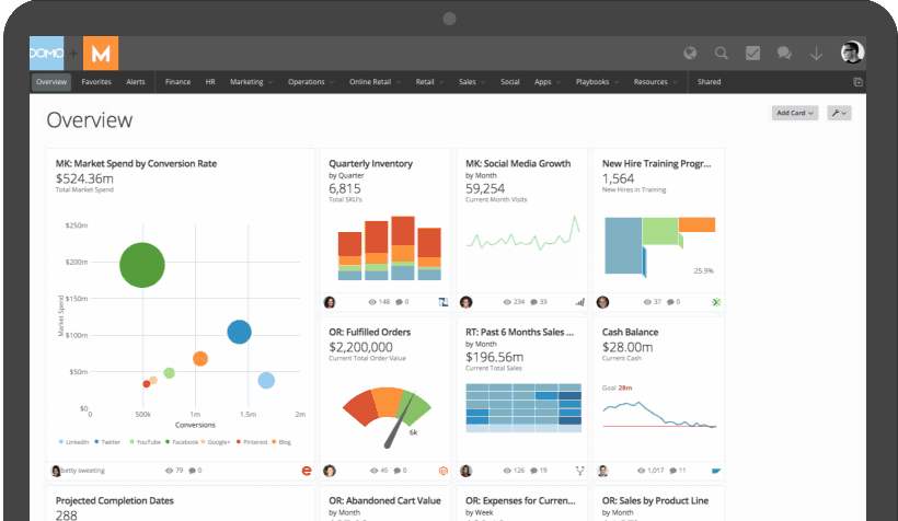
Domo offers perhaps the best functionality for those with high volumes of data to process. While it doesn’t offer much in the way of data cleaning and scrubbing, few solutions can ingest large data sets as quickly as Domo can. And with the demand for data only growing over time, the value of rapidly moving from data-aware to data-driven can’t be overstated.
When it comes to handling large datasets, Domo excels in speed and efficiency. Its system is designed to ingest and process data swiftly, a critical factor for businesses that depend on quick data analysis. This rapid processing capability sets Domo apart from other BI tools, including Microsoft Power BI, which may require more resources to scale for large data operations.
Domo’s continual evolution to meet the demands of big data analytics is evident in its recent updates. Enhancements like Nested Beast Mode Calculations, Cloud Amplifier, and Google BigQuery integrations, as well as advancements in Domo.AI, showcase the company’s commitment to staying at the forefront of big data processing and analytics all serve to add to its already powerful tools.
Domo’s user experience is tailored to manage complex data operations while maintaining an intuitive and user-friendly interface. This approach means that even with large datasets, users can navigate and utilize the platform without feeling overwhelmed.
Pricing: 3/5
General features and interface: 4.1/5
Core features: 5/5
Advanced features: 4.5/5
Integration and compatibility: 4.7/5
UX: 3.8/5
Domo is a SaaS startup that has quickly made a name for itself as a major player in the industry. With some of the most convenient data warehousing and ingestion in the market, support for MySQL and Postgres ETL, and extensive visualization options, it’s a tool set that has proven attractive for brands across numerous markets and use cases.
Domo is particularly well-suited for organizations that prioritize rapid data processing and have substantial datasets. Its ability to quickly ingest and analyze large volumes of data makes it an ideal choice for businesses where delays in data-driven decision-making are not an option.
Domo’s AI Service Layer, a framework at the core of its AI capabilities, now offers integration with OpenAI, allowing developers to build generative AI applications and develop language models that include their own data. This integration is a game-changer for Domo, enabling a more conversational approach to BI, where users can interact with the tool using natural language. This advancement significantly lowers the barriers to analytics, making it more accessible to a broader range of users.
It also has a comprehensive approach to AI, ranging from conversational capabilities to integration with third-party services like OpenAI and Google Bard. This includes model management for combining external models with Domo models, a critical feature for organizations looking to customize their AI solutions. The AI Service Layer also offers text-to-code translation capabilities, allowing users to query data using conversational language, which is then converted to code for processing and back to natural language for user comprehension.
In addition to these advancements, Domo has introduced SDKs within domo.js, batch inference, and data preparation capabilities, enhancing its efficiency in processing large volumes of data for use in generative AI models.
Areas for improvement for the platform include enhancing its data cleaning and scrubbing capabilities could provide a more comprehensive BI solution, reducing the need for external data preparation tools.
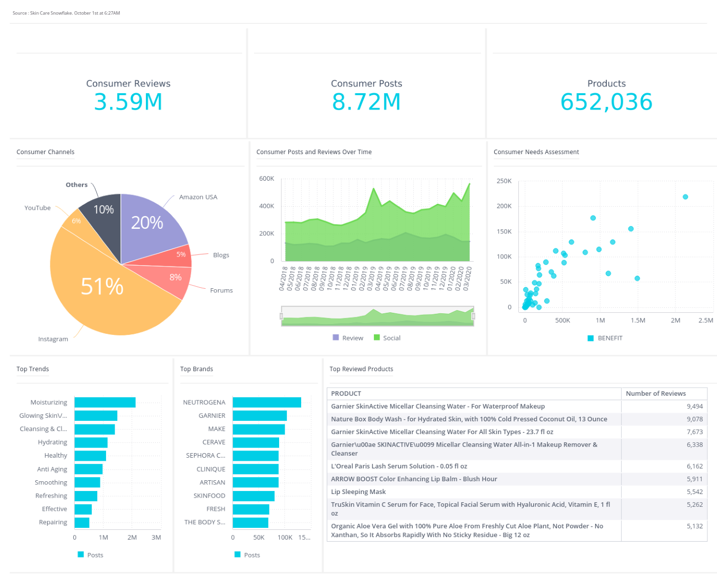
Yellowfin: Best for embedded analytics
Pros
Cons
Our Rating: 4.2/5
- Automated Monitoring and Data Discovery: Where many BI tools fall short is in the prep work; data is only useful if it’s clean and accurate. Yellowfin helps minimize the time and labor required to aggregate, clean, and standardize data, so you can make the most of it faster.
- White Label Support: Many organizations need analytics functions not just for their system but also for systems that depend on them. Yellowfin empowers teams to rebrand and embed analytics tools.
- Meta-Data Modeling: With a comprehensive modeling layer, Yellowfin enables meta-data analytics. Dig deeper into your data and how your organization generates and uses data than ever before.
- Guided NLQ: Yellowfin’s natural language query feature, Guided NLQ, makes it easier for less technical staff to access necessary information without having to pick up a SQL textbook.
- Free trial available via AWS Mrketplace
- Contact for quote; no listed pricing on website
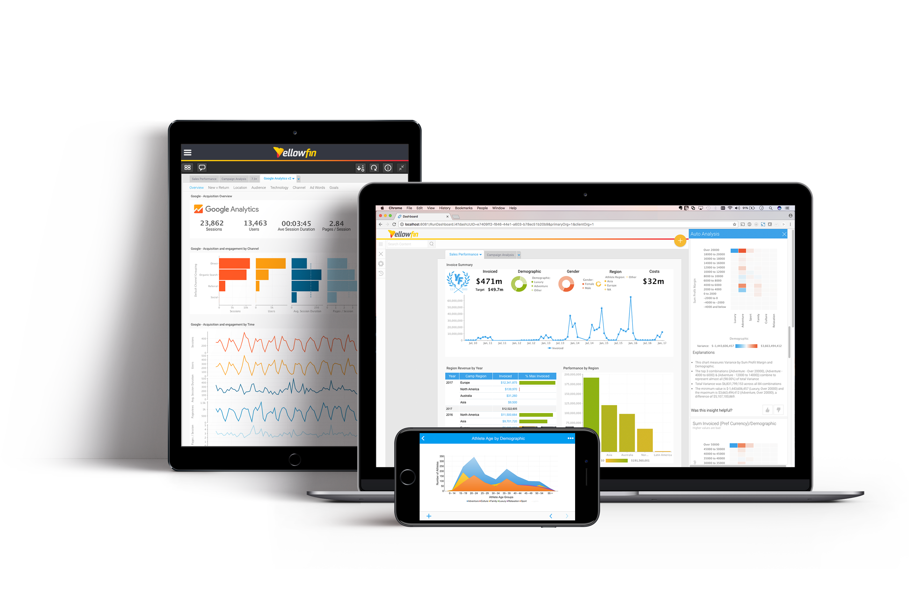
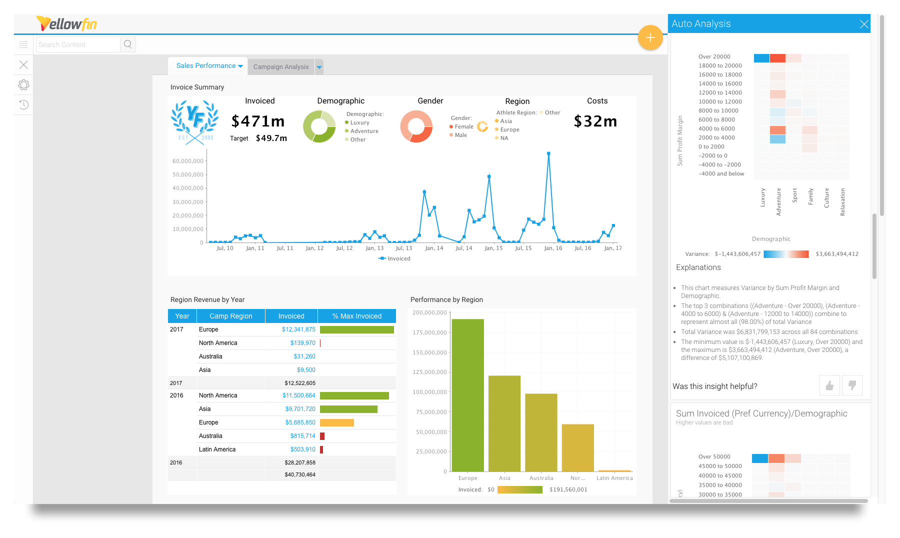
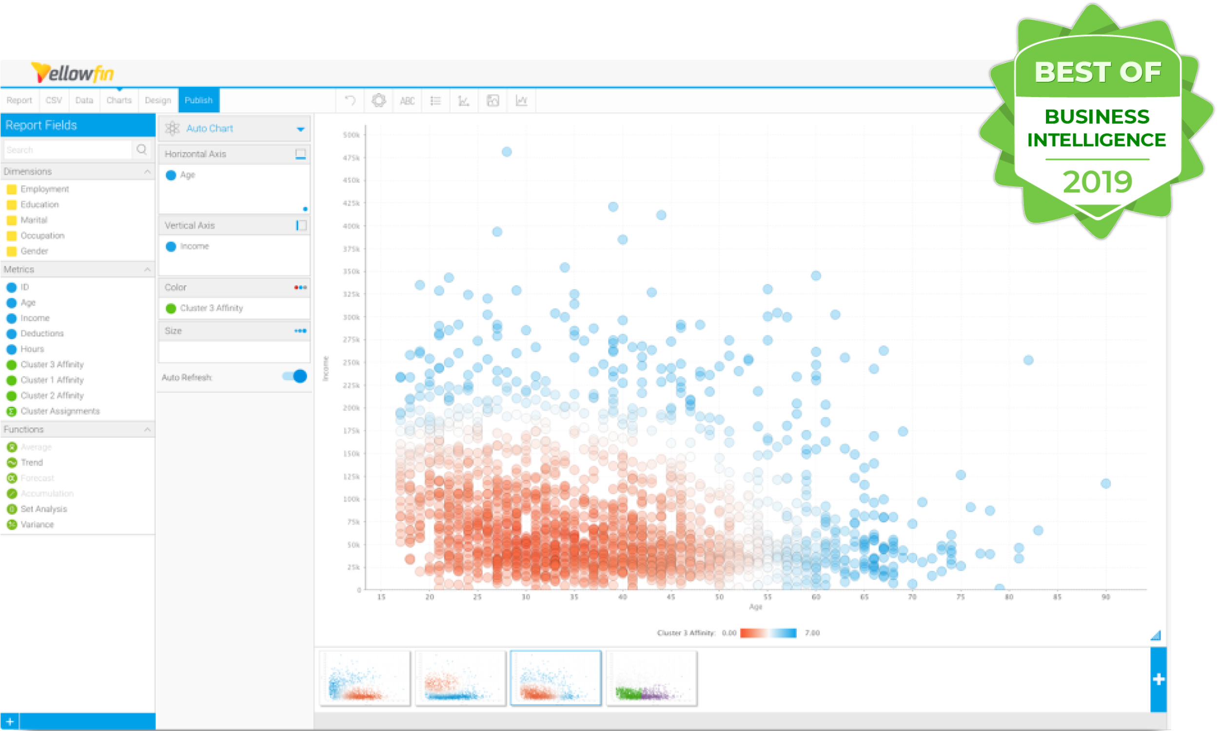
Yellowfin distinguishes itself in two ways: with its natural language query feature—helping users more easily query the database and pull the information they need—and with its full support of white-labeled analytics embedding. For brands that are looking to offer user-friendly data analytics with AI insights, Yellowfin is a solid choice.
Unlike Microsoft Power BI, which is often praised for its comprehensive data visualization and analysis tools, Yellowfin’s draw is its ability be fully integrated and white-labeled within other applications. This capability is crucial for businesses that aim to provide a seamless user experience without the apparent shift from their primary application to an analytics tool.
The design choices for the interfaces emphasize simplicity and efficiency. The platform’s user interface is crafted to reduce complexity, making analytics accessible to users of all skill levels. This design philosophy extends to its embedded analytics, where Yellowfin ensures that its tools blend seamlessly into the host application, maintaining a consistent user experience.
Pricing: 3.8/5
General features and interface: 4.1/5
Core features: 5/5
Advanced features: 4.3/5
Integration and compatibility: 4/5
UX: 3.8/5
Yellowfin has been on the market for quite some time. With a history in BI SaaS that stretches all the way back to 2004, it’s had plenty of time to carve out room for its offering in the space. Built as a bridge between back-end expertise and front-end user convenience, Yellowfin offers a number of quality-of-life improvements over many of its peers when it comes to ease of use and UI user-friendliness.
Its evolution is marked by continuous improvements in UI user-friendliness and ease of use, making it a more approachable option for a broader range of users compared to earlier versions or other tools in the market.
To maintain its edge, Yellowfin could focus on enhancing its data processing capabilities and expanding its AI-driven analytics features, areas where competitors like Microsoft Power BI have made significant strides.
Add to that full white-label support, and it’s the go-to tool for brands that need embedded analytics.
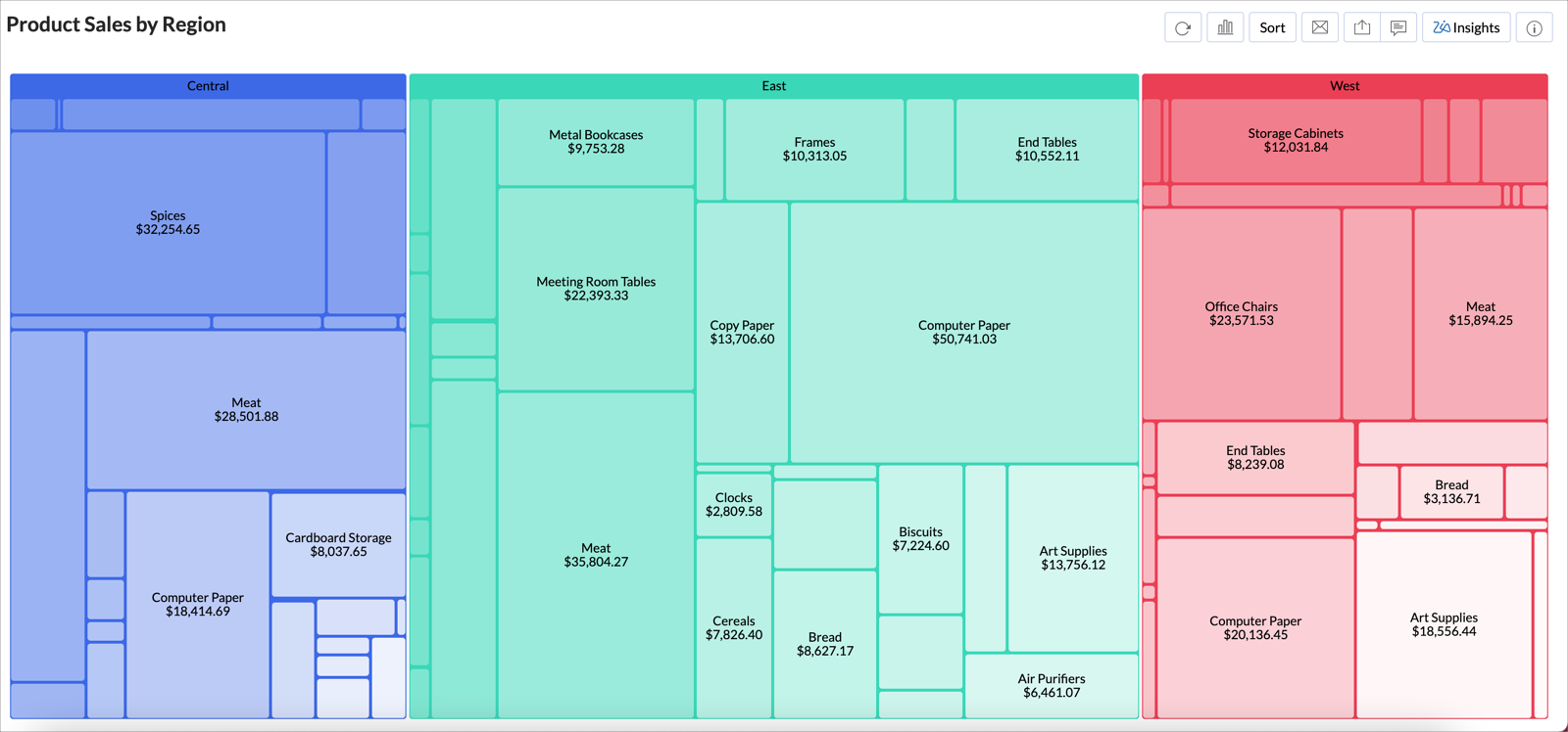
Zoho Analytics: Best for non-analysts
Pros
Cons
Our Rating: 4/5
- Data Preparation and Integration: Zoho helps teams use their data not just by pulling from their data sources but also by making standardization easier to achieve. Data integrity is a constant concern for analytics, so the tool has automated solutions to make it easier to clean data before running the numbers.
- Zoho App Family Integration: While Zoho Analytics can be used as a standalone product, it also has full integration and interoperability across the whole family of Zoho apps, so users can maximize the value of their subscription.
- Collaborative Analytics: As a remote-first brand, Zoho has built all of its apps to support distributed workforces. With Zoho Analytics, the software is designed to facilitate asynchronous collaboration, real-time updates, and other critical features.
- Host How You Need to Host: Zoho can be hosted on-prem or in the cloud, and cloud users can leverage the free version to determine if the tool will meet their needs.
Cloud Hosting
Basic: $24/month billed annually (or $30/month if billed monthly)
Standard: $48/month billed annually (or $60/month if billed monthly)
Premium: $115/month billed annually (or $145/month if billed monthly)
Enterprise: $455/month billed annually (or $575/month if billed monthly)
On-Prem Hosting
Personal: Free forever, on local servers, AWS, Azure, and Docker
Professional:
Local Server: $30/user/month billed annually, 5 user minimum
AWS: $0.25/hr + AWS usage fee, 5 user minimum
Azure: $0.40/hr + Azure Infrastructure Fee, 5 user minimum
Docker: $30/user/month billed annually, 5 user minimum
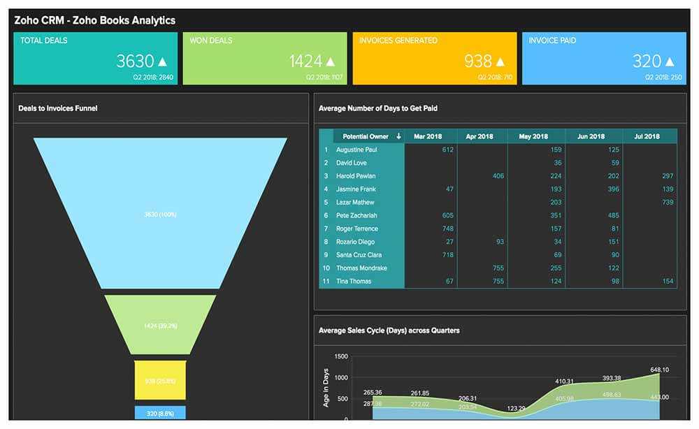
For those looking to get started with business intelligence, especially small teams (or even solopreneurs), Zoho is a solid bet. With an interface that requires minimal technical or data expertise to use and a robust help center, it’s perfect for inexperienced analytics users or users in a distributed work environment.
Its comprehensive support system also adds to its appeal to users who may not possess extensive technical or data expertise.
Zoho Analytics excels in ease of use, scoring highly for its intuitive design. This makes it more approachable for beginners or those without a background in data analysis. While both tools offer a range of integrations, Zoho’s broader suite of business tools, including CRM and HR software, provides a more seamless experience for users already within the Zoho ecosystem.
It democratizes data analysis, making it accessible to users regardless of their technical background.
Pricing: 3.8/5
General features and interface: 3.6/5
Core features: 4.2/5
Advanced features: 4.3/5
Integration and compatibility: 4/5
UX: 3.5/5
Zoho is, in many ways, the closest to Microsoft of all the competitors on this list, at least in terms of its full range of offerings. Just as Microsoft has Office 365, Zoho has Zoho One, a complete suite of business productivity tools and services. From a CRM platform to HR software and even IT management, Zoho provides quite the buffet of critical business support options.
In particular, its BI software is no slouch. Especially for professionals whose expertise lies elsewhere, Zoho Analytics offers a way for them to leverage the power of data without being data analysts or software developers themselves. Easy to learn, easy to use, and easy to get help when you need it, Zoho is a frontrunner for anyone looking to get started with BI.
Contrasting with Microsoft Power BI, which, while powerful, can be overwhelming for non-analysts due to its complex functionalities and steeper learning curve, Zoho Analytics simplifies data analysis without compromising on capabilities. This makes it more accessible to a wider range of users. For small teams or solopreneurs, Zoho Analytics is a more suitable choice due to its straightforward approach and ease of use. Power BI, while robust, might be better suited for users with a stronger background in data analysis or larger organizations that can leverage its advanced features.
Recent updates, such as enhanced email notifications, improved data visualization options, and the introduction of new connectors like Google Analytics 4 and YouTube Ads, demonstrate Zoho’s commitment to making data analysis accessible to all users. The tool prioritizes a user-centric design, offering a clean and intuitive interface that reduces the learning curve for non-technical users. This approach extends beyond the software’s functionality to its comprehensive support and learning resources.
However, while Zoho Analytics excels in user-friendliness, it could further enhance its capabilities by introducing more advanced analytical features and customizations, which are areas where Microsoft Power BI currently has an edge. This would allow Zoho to cater to a broader spectrum of users, from beginners to more experienced analysts. For more insights on Zoho Analytics’ features and updates, their Release Notes provide valuable information.
Sisense: Best for end-to-end BI
Pros
Cons

Our Rating: 4.1/5
- Unrivaled Data Sourcing: ElastiCube technology enables robust ETL and ingestion of massive data sets from disparate and siloed sources, so you can create a single source of truth for your organization.
- Git Integration: As a platform designed around technical users, Sisense has extensive integration with the tools that developers use the most, making it easier to customize as needed for a given use case.
- Advanced Analytics: Sisense offers AI- and ML-powered advanced analytics, including anomaly detection and predictive modeling.
- Democratized Data: Sisense supports embedded analytics and white labeling, so brands can offer data-driven functionality to those that do business with them.
Call for quote: no listed pricing or free trial
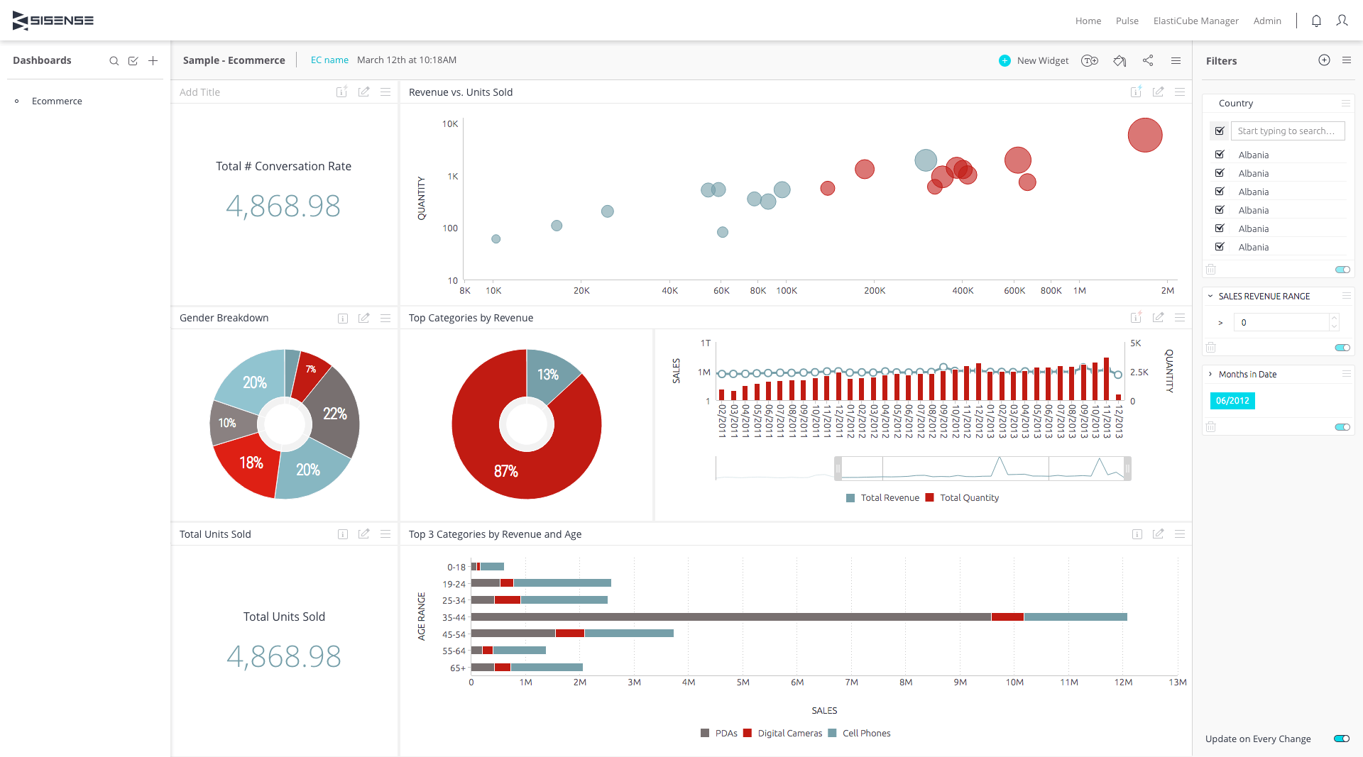
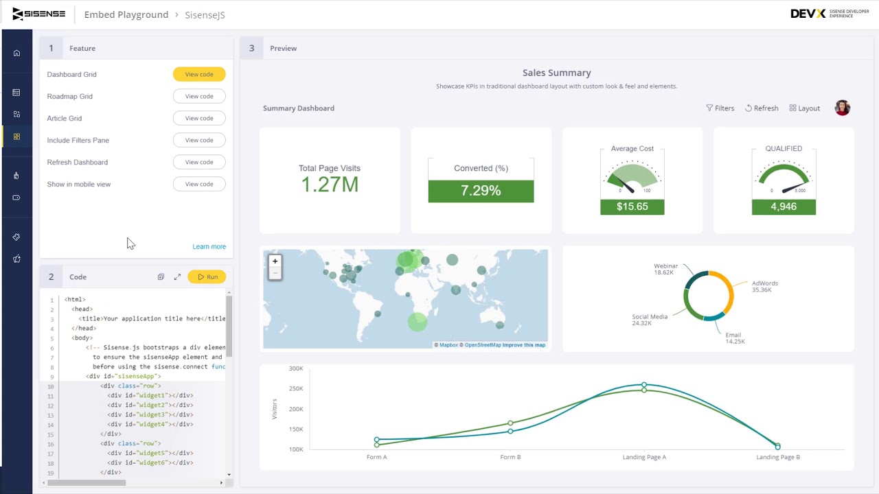
Sisense is the tool of choice for teams with plenty of data experience and technical expertise. When what you’re looking for is a force multiplier to get the most out of a capable, knowledgeable team, Sisense can enable analytics unrestricted by more restrictive UIs. And with its capabilities for ingesting massive data sets and advanced prediction models, there’s a lot to leverage for such teams.
It’s tailored for teams that boast considerable data experience and technical expertise, making it a force multiplier for those capable of leveraging its advanced features. This focus on a knowledgeable user base sets Sisense apart from Power BI, which aims to cater to a broader audience.
It excels in processing massive data sets and deploying advanced predictive models. While it might offer slightly fewer visualization options compared to some of its competitors, its strengths lie in the realms of machine learning and data science. This emphasis on technical prowess and flexibility distinguishes it from Power BI, which is more accessible but less customizable.
Pricing: 3/5
General features and interface: 4.3/5
Core features: 5/5
Advanced features: 4.5/5
Integration and compatibility: 4/5
UX: 3.8/5
Sisense is the tech expert’s BI. Rather than prioritizing end-user convenience, Sisense puts customizability and power front and center. From ETL to predictive analytics, Sisense offers the whole BI package to those who can implement it properly.
This trade-off means that making the most of the solution takes a fair amount of skill and familiarity with software and data, but the investment is well worth it. Despite having slightly shallower visualization options than some competitors, it’s a tool that brings the best of machine learning and data science to the table.
In its most recent updates, Sisense has made significant strides in enhancing its capabilities and user experience. The Highcharts charting library, a crucial component for data visualization, has been upgraded to version 10.3.3, promising more robust and efficient charting functionalities. On the connectivity front, all Java connectors have been reinstated post-upgrade, ensuring seamless integration with various data sources. In a move to enhance accuracy, Sisense has removed the ‘Hours’ option from Time Frame filtering, streamlining the data analysis process. Additionally, there have been notable improvements in several widgets, including the Calendar Heatmap, Column Charts, and Line Charts, which are pivotal for presenting data in an intuitive and visually appealing manner.
The design choices of Sisense reflect its focus on technical users. It offers a high degree of customizability, allowing users to tailor the tool to their specific needs, a stark contrast to Power BI’s more standardized user experience.
This approach, while advantageous for technically adept users, suggests an area for improvement. Enhancing the user interface to be more intuitive for less technical users could broaden Sisense’s appeal, making it a more versatile tool in the BI landscape.
For further insights and detailed information on Sisense’s capabilities and use cases, their resource library is an invaluable resource.
Qlik Sense: Best for mobile users
Pros
Cons
Our Rating: 4/5
- Conversational Queries: Qlik Sense prioritizes ease-of-use, even for less technical professionals, by enabling conversational queries and searches.
- Mobile-First Functionality: With strong mobile feature sets and 24/7 live support, users can make the most of their data wherever they are, whenever they need it.
- Predictive Analytics: Don’t just look to the past; prepare for what’s ahead. Qlik Sense makes it simple with predictive analytics functionality.
- User-Friendly Interface: Qlik Sense is intuitive and simple to use across multiple skill levels, making it just as useful for experts as it is for non-technical staff.
- Free Trial
- Business: $30/month/user, billed annually
- Enterprise SaaS: Call for quote
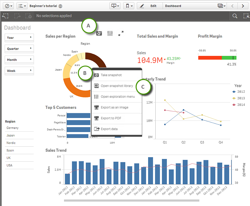

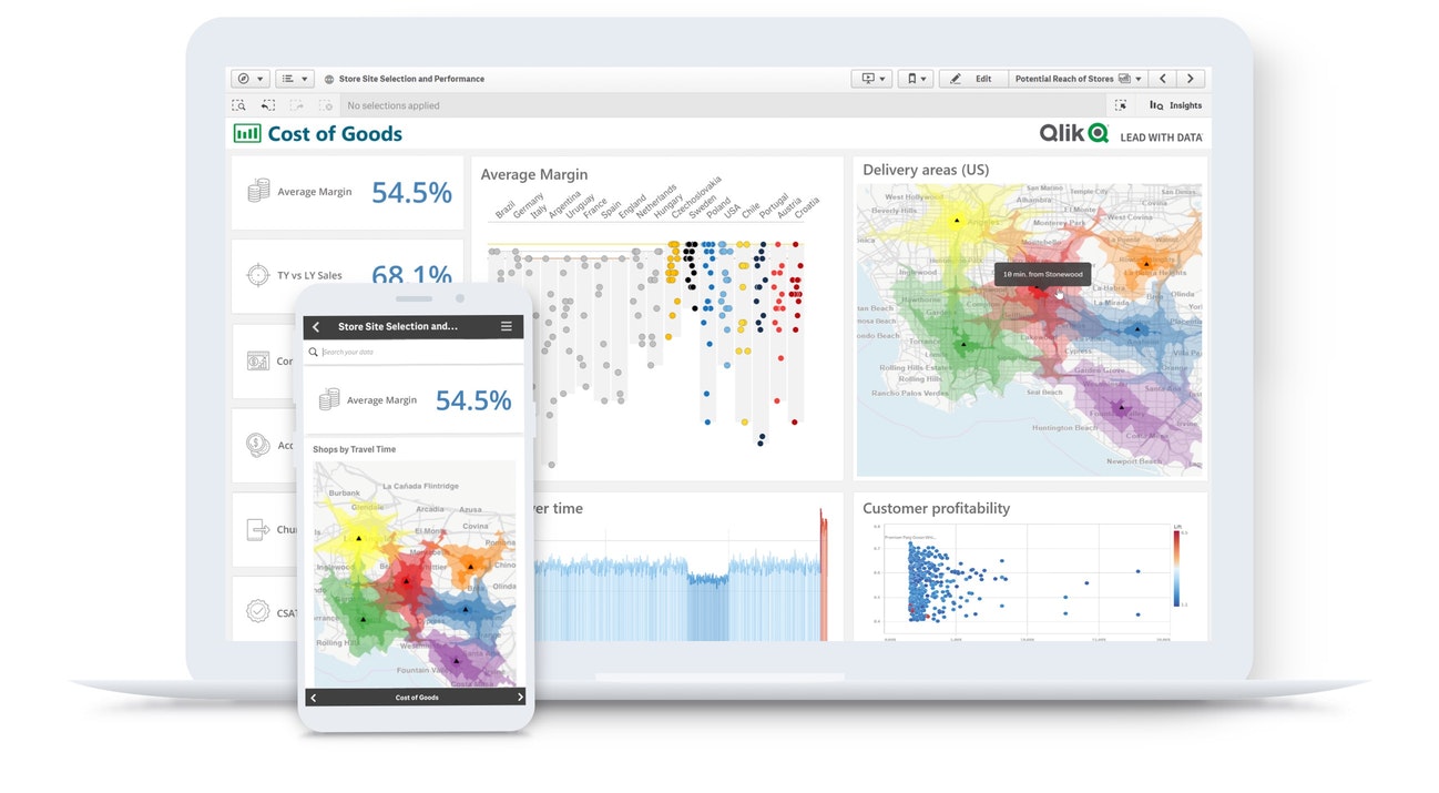
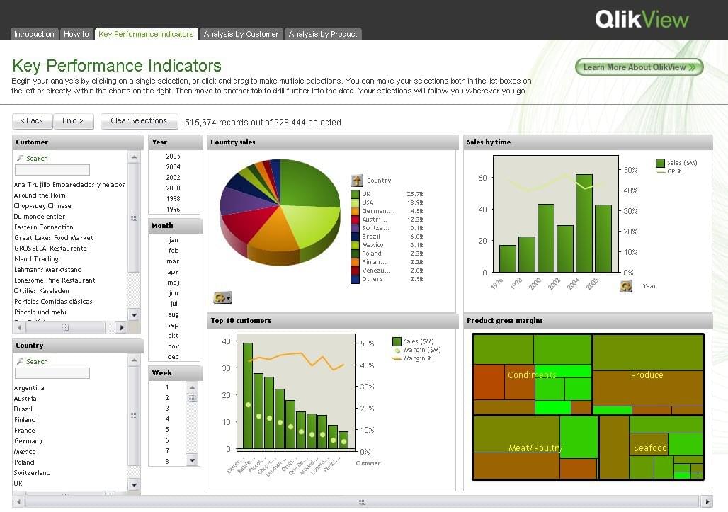
Qlik Sense brings to the table many of the same value propositions as its competitors on this list: convenience, robust functionality, customization, etc. Where it pulls away from the pack is how it prioritizes mobile functionality and provides full technical support. For teams that need access from everywhere and want to talk to a human being when things go wrong, Qlik Sense is a strong choice.
This focus provides a mobile app and responsive design, while also ensuring the full spectrum of Qlik Sense’s capabilities is accessible and fully functional on mobile devices.
Qlik Sense excels in areas crucial for mobile users: ease of use, performance, and support. The interface is designed with a mobile-first mindset, making it intuitive for users who may not have extensive technical expertise. Performance-wise, Qlik Sense efficiently handles large datasets on mobile devices, ensuring that users can access and analyze data quickly, without significant lag or compromise in functionality.
In comparison to Microsoft Power BI, Qlik Sense offers a more balanced approach. While Power BI is known for its deep integration with other Microsoft products and its advanced data modeling capabilities, Qlik Sense prioritizes a seamless mobile experience. This is particularly beneficial for teams that require constant access to data analytics across different locations and time zones.
The product design and user experience (UX) of Qlik Sense also contribute significantly to its appeal. The platform bridges the gap between backend data management and frontend user interaction, offering a cohesive experience that caters to both technical and non-technical users. This balance is crucial in a mobile context, where ease of navigation and clarity of information are paramount.
Pricing: 3/5
General features and interface: 4/5
Core features: 4.8/5
Advanced features: 4.3/5
Integration and compatibility: 4/5
UX: 3.5/5
Bridging the gap between solutions that prioritize the back end and those that prioritize the front end, Qlik Sense offers a little bit of everything. It’s flexible enough to appeal to those with stronger tech expertise while being intuitive enough to be useful for those who lack it.
What’s more, Qlik Sense has put anywhere operations at the core of their service, enabling access and usability from nearly anywhere with an internet connection. If teams need to stay connected across time zones and during travel, Qlik Sense should be on their shortlist of BI solution options.
While it excels in these areas, there’s always room for improvement, especially in terms of integrating more advanced AI capabilities and predictive analytics features, which are areas where competitors like Microsoft Power BI are advancing. By continuing to evolve in these aspects, Qlik Sense can further solidify its position as the go-to mobile BI tool.
When to use Microsoft Power BI
Despite the rich offerings of its peers on the market, Microsoft Power BI is still worth considering under certain circumstances. First and foremost, if your organization already relies on the Microsoft family of tools, Power BI makes sense as a solution, if for no other reasons than compatibility and integration.
Similarly, those running on Azure will find it easy to implement and deploy Power BI in Microsoft’s own environment.
Finally, if security is a major concern, Power BI is worth considering. Microsoft has built much of its reputation on security, stability, and reliability for business users. Its tools include extensive features and options for controlling access and permissions and make the work of managing even a distributed team with both business-owned and personal endpoints much easier.
When not to use Microsoft Power BI
Still, Microsoft Power BI has some odd limitations. For one, the interface is somewhat dated in looks, feel, and functionality. What’s more, it can require some time and technical skill to deploy, especially when implementing outside of a Microsoft-centric environment. Finally, despite its less intuitive interface, Power BI is not as powerful for advanced users as some of the other options on this list.
Ultimately, which product you choose will come down to particulars in the use case and budget limitations. Hopefully, this list has offered some clarity on the matter and made the search a little easier.
Choosing the right alternative to Microsoft Power BI
Choosing the right business intelligence software for your business is a major decision. Whether the reason is cost or your particular needs, it pays to do your research on the front end. For a more thorough analysis, check out our Business Intelligence Software Buyer’s Guide.
Featured Partners
Featured partners
FAQs
Popular alternatives to Microsoft Power BI include Tableau for its advanced visualization capabilities and Qlik Sense for its associative data modeling.
Yes, Zoho Analytics and Sisense are cost-effective alternatives to Microsoft Power BI, offering robust data analytics and visualization features at a more accessible price point.