Key takeaways
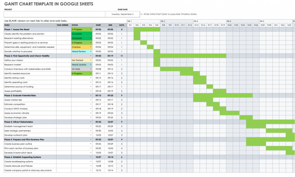
A Gantt chart is a visual tool that displays project assignments, durations, and dependencies in a timeline format. Gantt charts help project managers and teams monitor progress, allocate resources, and manage timelines efficiently. If you want to know how to make a Gantt chart in Excel, you came to the right place.
Project management software programs like Asana, Wrike, and Smartsheet can help you create a Gantt chart. However, one software that stands out is Microsoft Excel. Its grid-based interface allows for easy organization of tasks, durations, dependencies, and milestones.
Excel’s customization options enable you to tailor the chart to your specific needs, such as adding labels, colors, and progress indicators. The good thing is that you don’t need to be an Excel expert to create a Gantt chart. While having some familiarity with Excel can certainly be helpful, creating a basic Excel Gantt chart can be achieved by following these simple steps below.
How to make a Gantt chart in Excel: A step-by-step guide
Here’s a straightforward step-by-step guide on how to create a Gantt chart in Excel. By following these instructions, you’ll be able to visualize your project timeline effectively and track your tasks with ease.
1. Make a table for all of your project information.
Before creating the Excel Gantt chart, you must prepare the data upon which it will be based. In the Excel sheet, input your project details in table format. Since a Gantt chart resembles a timeline, the following information must be included in your table:
- Task names (or task descriptions)
- Start date
- End date
- Task duration
To get the value for task duration, simply subtract the start date cell from the end date cell. Here is a sample of how it would appear in Excel. Assuming your start date is in cell B2 and your end date is in cell C2, you can calculate the duration using the following formula in another cell (let’s say cell D2): =C2 – B2
Also read: How to Use an Agile Gantt Chart for Project Management
2. Add an Excel bar chart
Excel offers a variety of bar chart types, but a Stacked bar chart should be used to construct a Gantt chart. This will be the substructure of your Gantt chart.
To create an Excel stacked bar chart:
- Click on a blank cell on the same sheet as your project table.
- Select the Insert tab from the Excel menu.
- Select the 2D Bar group within the Charts group, followed by the Stacked Bar option.
- A blank box will then appear.
3. Using the data from your project to create the bar chart.
For the bar chart to appear, it has to reflect data. Right-click on any space in the chart area and click Select Data. A dialogue box will appear, and this is where you can start entering the data.
Begin by adding the start dates.
- Under the Legend Entries (Series), click Add.
- The Edit Series pop-up box will appear.
- For the Series Name, click on the “Start Date” cell.
- For the Series Values, you should highlight the full range of the start dates.
- Click OK.
The next set of data that you need to add is the duration.
- In the Select Data dialogue box, click Add.
- For the Series Name, click the “Duration” cell.
- Similarly, highlight the range of cells under duration for the Series Values.
- Click OK.
At this point, the stacked bar Excel chart will start to resemble a Gantt chart. It will look something like this:
Now that the data for the horizontal axis are all set, it’s time to add the data for the vertical axis.
- Start by launching the Select Data box (right-click on any space in the chart and click Select Data).
- This time, click Edit under Horizontal (Category) Axis labels. You can find this on the right-hand panel.
- Highlight the range of the tasks or task descriptions (excluding the column header).
- Click OK.
Featured Partners
Featured partners
4. Format the chart
Now that your stacked bar is up and it reflects the data you need for a Gantt chart, it’s most likely in blue and orange looking like this:
If it does, that’s great! That means you’re only a few steps away from turning it into a proper Gantt chart. It just needs a few tweaks and customization.
- First, right-click on the blue section of the bar and click on Format Data Series.
- The formatting options will appear on the right-hand side of the screen.
- Click the icon that looks like a paint bucket, and then click Fill.
- Tick the bullet point for No Fill.
At this point, only the orange bars are visible, and it’s starting to look like a Gantt Chart.
What you need to do next is to rearrange the project tasks correctly.
- Begin by right-clicking on the vertical axis (in this case, the tasks or task descriptions) to launch the Format Axis pane on the right-hand side.
- Under the Axis Options, you have to put a check in Categories in reverse order.
- Once you do that, the data markers will move from the bottom to the top, making it look like a proper Gantt chart.
Also read: Gantt Charts for Project Management: A Guide
5. Customize your Gantt chart
After following all the steps above, you are now familiar with how to create Gantt chart in Excel. You now have a proper visual of your project tasks and duration. But you can make this chart even better by customizing the colors according to your preference.
Here are some additional customizations you can do:
- Change the bar charts from 2D to 3D format. You can even add shadows.
- Modify the color of the bars.
- Adjust the width (make them wider or thinner).
- Add chart elements such as a chart title, legend and gridlines.
Remember, a good Gantt chart should have a clear structure, show the project timeline, and how resources are used. To ensure its reliability, you should update the data accurately and promptly. You can also use color coding and conditional formatting to show success and make the chart easy to read. By following these steps, you can make a clear Gantt chart for planning and managing projects.
Looking for the latest in Gantt Chart solutions? Check out our Gantt Chart Software Guide.